
Did we even need EBP?
In 2015 and 2016 I developed a formula designed to uncover the dependence of a baseball team’s run production on its On Base Percentage. I called it Expected Binomial Production, or EBP. I then realized that this formula could be used as a run estimator – just plug in the team’s on base percentage to get their expected number of runs per inning on the season. I then needed to study up on run estimators to see if mine was at all accurate. It fared pretty well – not the best, but not bad either. Middle-of-the-pack, I’d say. But complicated as all heck, and only useful for teams. For the purposes they were developed for, run estimators developed in the 1980’s and 1990’s were still better choices, as they can be applied to individuals, and are much simpler to calculate, for just two of the reasons. I was wondering if anyone might find any new value in EBP at all.
I do see potential to use EBP as the foundation for some run estimator that would beat all others in accuracy. But I’m pretty sure nobody cares much about that anymore, except for the intellectually curious. (I’m sorry EBP, you’re just a couple of decades late to the party.) And many will find the complexity of its formulation distasteful.
But it does have some cool tricks that other run estimators don’t have, like predicting frequencies of innings with particular numbers of runs, and showing how run production would be different in a game of baseball played with 4-out innings, or some other number of outs per inning. So there’s some possible value there.
But what about the thing that EBP was designed for? Could existing run estimators be reworked to show the relationship between OBP and run production? Did EBP even provide anything new in doing that?
Could it have worked using what we already had?
When I thought about that question, I realized that even though the formulas for existing run estimators don’t show an explicit relationship between run production and OBP, that they should do so implicitly. The key was realizing that the numbers that are put into those existing run estimators (walks, hits, etc.) will undergo the same kind of explosive growth as EBP does when OBP gets close to its maximum value of 1. This is the “fixed outs explosion” that I refer to elsewhere. And because each of those inputs will undergo the fixed outs explosion (combined with the fact that the formulas are somewhat proportional to these inputs), each of these run estimators will undergo the fixed outs explosion as well. Even those with linear formulas will exhibit this nonlinear behavior. And that told me that, if I could feed in realistic input numbers that go along with all possible values of OBP (from 0 to 1), I might be able to get these run estimators to show me a reasonable relationship between run production and OBP.
This led me to wonder, how well will they do that? And how well do their results compare to EBP’s?
Let’s see if we can do this using what we already had
At first I tried coaxing the OBP dependence out of some of the main known run estimators by reworking their formulas to show an explicit dependence on OBP. It quickly became clear, however, that that approach could not work with most of them. So instead, I would have to mock up data that shows how each input used by these formulas – walks, hits, strike outs, double plays, stolen bases, and more – will vary with changes in OBP. Then I would run my mocked-up numbers through the run estimator formulas to plot curves showing what the p-dependence of these run estimators might look like.
I found it quite difficult to find formulas that produced mocked-up numbers that made sense. The hardest part, and the most critical part, was getting the dependence of plate appearances as a function of p correct (p represents the probability of a player reaching base, and it is assumed to equal the team’s OBP). All the details of how I came up with this and the other formulas are spelled out in How I mocked up OBP dependence for basic offensive baseball statistics, for those who are interested. Here, I’ll just list a table displaying an abbreviated version of the resulting basic stats for the 1994 Cleveland Indians:
| p | PA(p) | AB | 1B | 2B | 3B | HR | BB | IBB |
|---|---|---|---|---|---|---|---|---|
| 0.0 | 3,052.0 | 3,052.0 | 0.0 | 0.0 | 0.0 | 0.0 | 0.0 | 0.0 |
| 0.1 | 3,324.2 | 3,216.1 | 151.9 | 49.4 | 4.1 | 34.4 | 78.6 | 8.2 |
| 0.2 | 3,678.7 | 3,450.3 | 336.2 | 109.3 | 9.1 | 76.1 | 174.0 | 18.2 |
| 0.3 | 4,144.5 | 3,773.9 | 568.2 | 184.8 | 15.4 | 128.6 | 294.1 | 30.8 |
| 0.4 | 4,770.7 | 4,221.9 | 872.0 | 283.6 | 23.6 | 197.3 | 451.4 | 47.3 |
| 0.5 | 5,644.9 | 4,858.6 | 1,289.8 | 419.4 | 35.0 | 291.9 | 667.6 | 69.9 |
| 0.6 | 6,937.0 | 5,810.1 | 1,902.0 | 618.5 | 51.5 | 430.4 | 984.5 | 103.1 |
| 0.7 | 9,025.2 | 7,357.9 | 2,886.9 | 938.8 | 78.2 | 653.3 | 1,494.3 | 156.5 |
| 0.8 | 12,948.0 | 10,276.9 | 4,733.4 | 1,539.3 | 128.3 | 1,071.1 | 2,450.1 | 256.6 |
| 0.9 | 22,965.9 | 17,747.1 | 9,445.2 | 3,071.6 | 256.0 | 2,137.3 | 4,889.0 | 511.9 |
| 1.0 | 101,996.2 | 76,734.0 | 46,608.8 | 15,157.3 | 1,263.1 | 10,547.0 | 24,125.4 | 2,526.2 |
| p | HBP | ROE | XI | SB | CS | SO | GDP | SH | SF |
| 0.0 | 0.0 | 0.0 | 0.0 | 0.0 | 0.0 | 667.0 | 0.0 | 0.0 | 0.0 |
| 0.1 | 3.7 | 10.3 | 0.0 | 45.3 | 16.6 | 653.9 | 29.1 | 12.0 | 13.8 |
| 0.2 | 8.2 | 22.8 | 0.0 | 82.1 | 30.1 | 643.2 | 52.1 | 21.5 | 24.7 |
| 0.3 | 13.9 | 38.5 | 0.0 | 113.6 | 41.6 | 634.1 | 70.6 | 29.1 | 33.5 |
| 0.4 | 21.3 | 59.1 | 0.0 | 142.7 | 52.3 | 625.6 | 85.8 | 35.4 | 40.8 |
| 0.5 | 31.5 | 87.4 | 0.0 | 172.8 | 63.3 | 616.9 | 98.2 | 40.5 | 46.7 |
| 0.6 | 46.4 | 128.9 | 0.0 | 208.7 | 76.5 | 606.4 | 108.2 | 44.6 | 51.4 |
| 0.7 | 70.4 | 195.6 | 0.0 | 259.3 | 95.0 | 591.7 | 115.5 | 47.7 | 54.9 |
| 0.8 | 115.4 | 320.7 | 0.0 | 348.1 | 127.6 | 566.0 | 118.9 | 49.1 | 56.5 |
| 0.9 | 230.4 | 639.9 | 0.0 | 568.7 | 208.4 | 501.9 | 112.1 | 46.2 | 53.2 |
| 1.0 | 1,136.8 | 3,157.8 | 0.0 | 2,297.8 | 841.9 | 0.0 | 0.0 | 0.0 | 0.0 |
Important to note is that these simulated numbers do factor in outs and base advances on the basepaths. Total number of outs is assumed constant, so as outs made by batters goes down to zero as p goes up to 1, the number of outs made by baserunners goes up by the same amount. This prevents plate appearances – and correspondingly run production – from going up to infinity. The factor that decides how high it does go is the choice of what percentage of baserunners make outs. This choice was made by fitting a curve to a graph of team seasonal numbers for percentage of baserunners making outs plotted against p.
Taking these numbers and plugging them into the run estimator formulas gives an estimated p-dependence to each formula. These are just estimates and could be wrong – especially, at extreme values for p, strategy will change and with it the relative importances of power to on base percentage, and so therefore their relative levels of use. But as we will see, I have pretty good confidence in them.
Plots of the p-dependence of the run estimators
I’ll present these in three sets of charts, grouping run estimators by their functional forms: Linear, Nonlinear (OB*Advancement), and Hybrids of these two. For descriptions of these categories of estimators, and of each of the individual estimators themselves, see my page of Descriptions of baseball run estimators. But first, a few words (okay, maybe several) about what we expect to see.
Expected appearance
As discussed throughout the article on interpreting the EBP plots, the runs per inning plots should start at 0 when p is at its minimum value of 0, and go to infinity, or a very large finite number, at maximum p of 1. My guess is that large finite number should be around 100 up to several thousand, depending on how often baserunners make outs.
But visual inspection of those runs per inning plots won’t tell us as much as they could about whether the curves are sensible ones or not. In part this is because while the independent variable (p, or OBP) can take values from 0 to 1, the dependent variable (runs per inning) can take values from 0 to infinity. We can do something about that by converting p (OBP) to an equivalent form that runs from 0 to infinity. If OBP can be described as “base reaches per plate appearance”, this new form can be described as “base reaches per batter out”, which I’ll simply call BRPO. In changing the denominator from plate appearances to outs, we put the independent variable on equal footing with our dependent variable. That’s because the numerator of Runs Per Inning (runs) is basically comprised of a fixed number of base advances (4), while the denominator (innings) is comprised of a fixed number of outs (3). Contrast that to OBP where the denominator is plate appearances, which is not fixed at all and could hypothetically trend to infinity.
The conversion from OBP to BRPO is BRPO = OBP/(1-OBP), and OBP = BRPO/(1+BRPO).
In a game of baseball where no outs are made by baserunners, Runs Per Inning versus BRPO will start at 0 for p=0, then approach a line with a slope of 3 and a y-intercept near -2. This y-intercept represents us subtracting a number of baserunners from our run total for the inning; that number is the average number of runners left on base in innings that cross the run-scoring threshold (and at very high BRPO, pretty much all innings cross the run-scoring threshold). In such innings, extra baserunners equal extra runs (on average), and because innings have 3 outs, 1 extra BRPO equals 3 extra baserunners in the inning, and so an average of 3 extra runs for every 1 extra BRPO.
In a game of baseball when baserunners make outs, they’ll become very cautious at high BRPO values, to the point that nearly the only way that baserunners make outs is when there’s a double play (I’m not counting fielder’s choices). As double play totals are typically about 3% of out totals, we’ll average about 2.9 batter outs per inning. 2.9 batter outs per inning means 1 extra BRPO produces 2.9 extra runs on average, in innings that have crossed the scoring threshold. So we should see curves that approach a line with slope near 2.9, and a y-intercept at the negative of the average number of runners left on base in innings that cross the run-scoring threshold (approximately -2).
I’ll show one example of RPI versus OBP plots below, but then will switch to just showing RPI versus BRPO.
Now to quickly cover runs per plate appearance, and runs per base reach.
The runs per plate appearance plots should start at 0 for p = 0, and curve upward to a maximum of 1 for p = 1, or a value just below it, in the .96 to .999 range (based on my guess at how many baserunners would make outs).
The runs per base reach plots are most interesting at p=0. There, they should have a value that is at or just above the fraction of base reaches for the team that are home runs. For the team chosen for these plots, the 1994 Cleveland Indians, that value is .103 – meaning that for these Indians, 10.3% of their base reaches were home runs. At p = 1, we also expect them to be in the .96 to .999 range.
The Linear run estimators
Our first set of charts shows the run production that the following five linear run estimators give us when we provide them the input data we generated for the 1994 Cleveland Indians (and EBPt included for reference):
- Extrapolated Runs (XR)
- New Estimated Runs Produced (NERP)
- Estimated Runs Produced (ERP)
- Equivalent Average runs (EqR)
- Weighted Runs Created (wRC)
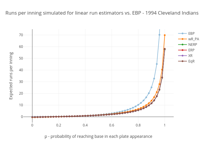
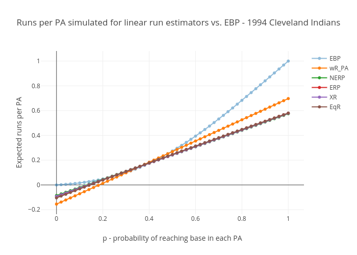

They all go negative between p=.12 and p=.19. This is of course impossible in actual baseball, and these go negative for OBP’s not far from the ones you see against the best pitchers in the game. In other words, these go negative at what is possibly the expected OBP in some actual single MLB games. Also, their runs per plate appearance plots don’t have the upward curvature we expected – they’re straight lines, well *almost* perfectly straight lines, anyway. But that’s to be expected given that they’re linear formulas. Finally, at p=1, their runs-per-plate-appearance (and runs-per-base-reach) numbers are well below the .96 to .999 range we’re looking for.
This is not news. It’s been well established, a long time ago, that linear run estimators have a relatively narrow range of on-base rates over which they are accurate. But they suit their purpose well, that of evaluating the values of the offensive contributions of major league players, relative to their contemporaries and relative to players of prior generations, as originally shown by Pete Palmer in The Hidden Game of Baseball.
Looking at the chart, these curves demonstrate that narrow range over which they are accurate. Notice how all the curves bunch together in the p=.30 to p=.37 range within which almost all team seasonal values fall. Everybody’s right where it counts, but outside the team average values for p that we see in actual gameplay, linear run estimators appear to do poorly. And for individual matchups, we’ll see values of p outside that range.
The product-based run estimators
The next set of charts shows the run production that the following four nonlinear run estimators give us for the 1994 Cleveland Indians.
- Runs Created, and Runs Created – stolen bases (RC & RCsb)
- Runs Created – technical (RCtech)
- Total Offensive Productivity (TOP)
These include the original Runs Created, which set down the basic principle of multiplying a base-reaching rate by a base-advancement rate. All the others in this category are basically increasingly complex variations of this principle. (I’ve never seen TOP referenced outside of the original author’s web page about it, but it seemed intriuging so I thought I’d include it.)
Note that I show one line for RC and RCsb because their plots are pretty much identical (so are those of EBPt and EBPf, by the way, although those do have a very slightly visible difference). Here are the plots:
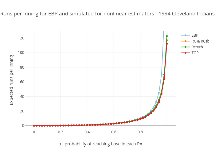
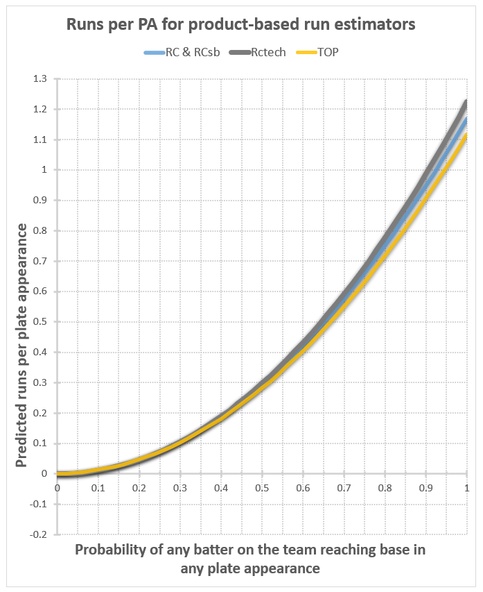
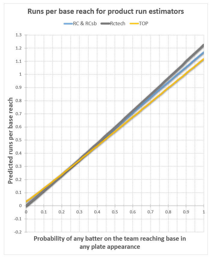
Well now, that’s much better. The runs per PA plots have a nice upward curve, as expected, and start at 0 when p=0, as they should. For the runs per base reach plots, at least we’re in the realm of the possible now at p=0, even though they’re all well below our expectation of .103 or so (the Cleveland Indians’ home run fraction). For these to be correct in a real-world situation, our assumption that the rate of home runs relative to other kinds of base reaches stays the same would have to be wrong. Instead of staying the same, it would have to decrease as on base percentage decreases, mostly disappearing in the case of TOP (from .103 to .032), and entirely disappearing in the case of all the versions of Runs Created. That’s entirely plausible, considering that a dropping OBP probably corresponds with a lot less good contact relative to bad contact, so a lot fewer balls hit a long distance relative to the number hit a short distance. Then again, this would be offset to some extent by the fact that teams would focus more on trying to hit home runs, as that’s pretty much the only way they can score anymore. I don’t think it would drop this much; in my judgement, these numbers are too low.
At p=1, however, no judgement is required to fault the results – they’re impossible. You can’t have more runs than base reaches, and certainly no more runs than plate appearances, so these curves should never go higher than 1. Yet they’re all peaking at higher than 1.1. This doesn’t happen on every team’s plot. It seems to be worse for teams that hit a high percentage of home runs. In the half dozen or so teams I’ve plotted, at least half of them share this flaw for these nonlinear estimators.
The Hybrid run estimators
Now on to the last two estimators we’ll look at – the hybrids:
- Runs Created – 2002 (RC2002)
- Base runs (BaseRun)
Both of these formulas are the sum of a linear portion (in the style of the linear run estimators) and a nonlinear product (in the style of the base-reaching rate times base-advancement rate nonlinear estimators). However, they go about this in very different ways, with very different results:


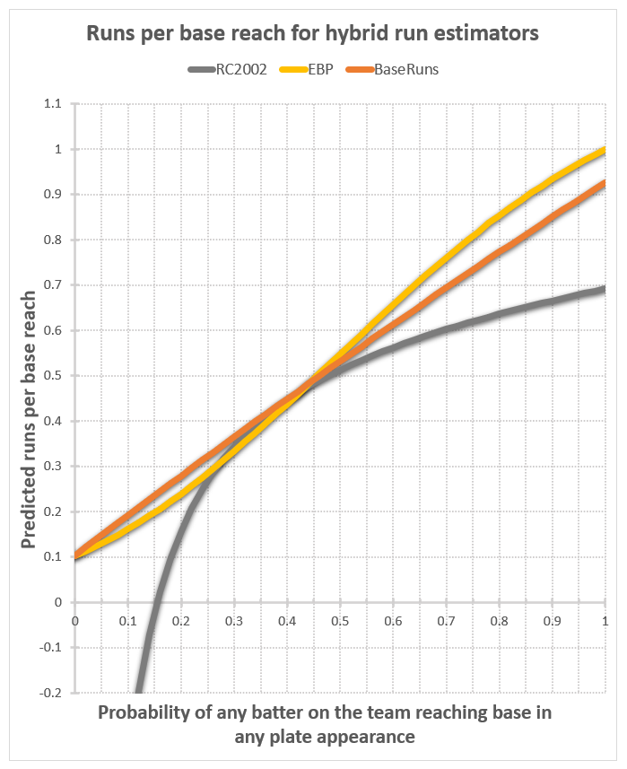
RC2002 is like the worst of both worlds, lacking the formulaic simplicity of the linear run estimators, while behaving just like them in its p-dependence, including taking negative run values for low p.
But look at Base runs. At p=0, the runs per base reach plot takes the value of the team’s home run fraction, right near where we expected it to be. At p=1, the value is .93 – below the .96 to .999 range we expect by my guess, but not very far off. And it’s p=1 value is close for every other team I’ve looked at thus far. It’s been said of Base runs that it models the reality of the run-scoring process significantly better than any other run estimator. These results lend support to such praise.
So in retrospect, did we need EBP?
So we’ve found out that, after all, there was one existing run estimator (Base Runs) that could have been used to examine the OBP-dependence of run production. One could argue that because Base Runs appears to do a pretty good job of showing that OBP dependence, that EBP is superfluous, and didn’t need to be made. I have a few responses to that.
- I didn’t know.
- Coaxing that OBP-dependence out of Base Runs was about as difficult as was creating EBP, so just deriving EBP may have been the more efficient way to proceed, anyway.
- There are different shapes to the OBP-dependence curves for EBP and Base Runs, and those differences may carry some significance.
- EBP has plenty of room for improvement, and could become the foundation of a more-accurate-than-ever run estimator. For fun, if nothing else.
- EBP still has those other cool tricks up its sleeve that traditional run estimators cannot do.
About the shapes of these plots
There are some interesting things to note on the shapes of these curves. One is that every linear run estimator appears as an almost perfectly straight line on the runs per plate appearance charts, and curved on runs per base reach; while the nonlinear estimators appear very close to being straight lines on the runs per base reach chart, and curved on the runs per plate appearance chart. These aren’t quite straight lines on the runs per base reach chart, however. They tend to have a slight upward curvature for lower p values, and a slight downward curvature for upper p values. In the case of RCtech, it’s upward throughout the whole range for every team I’ve checked. In the case of TOP, sometimes it’s all upward; in the case of Base runs, for some teams it’s all upward, for some it’s all downward, and for some it’s up then down. But in every case, the curvature is so slight that to the eye these look pretty close to straight lines.
EBP, by comparison, has a very pronounced upward curvature followed by a very pronounced downward curvature for every team. Because EBP is the only one of these specifically derived based on p, I suspect the real-life p-dependence of run production to follow EBP’s curvature, but to have values in the high-p range closer to those of Base runs.
