We are at nearly the halfway point in the season, and I’ve been noticing the Red Sox do some similar things to last season. They sure seem to be hitting the .500 mark a lot. They’ve been 18-18, 19-19, 20-20, and more. Now they’re 40-40. So I wondered, how are they stacking up to last season, when I granted them the title of the Most .500 Team in Baseball?
They are excelling, actually. Right now they have the lead.
If you measure by who has the most nearly .500 record, they lead all of baseball there:
If you look at that “Games above .500” column, the Red Sox are the only team at .500. And while teams that have played an odd number of games can be no closer than 1 game from .500, no teams are that close. The Sox are clear “winners” in this category.
We can also look at the number of times a team has been at .500 during the season. This gives an idea of whether the team has consistently played like a .500 team through the year. This time we’re looking at that “Times at .500” column:
Showing just the top 8 teams here. The Red Sox and the Reds are clear leaders in this category.
One more. We can look at which teams have the smallest difference between runs scored by them and runs scored against them. This we have in the Run diff column. Negative numbers mean the team allowed more runs than they scored.
The Red Sox are among the 4 leaders here.
But what I find more interesting is to consider balancing a team’s record against their run differential, because some teams have a positive run differential but a losing record, or vice versa. We have four good examples of this, this year. Now there are those who take a team’s run differential and convert it into a number of expected wins and losses for a team. So I took the difference of those for each team to get an expected number of games above .500 for those teams (see the “Expected GA .500” column). Then I averaged this with their actual games above .500 to see where the expected and actual balance out. These averages are listed in the “Ave GA XGA” column.
The Braves, Rangers, Blue Jays, and Gaurdians all have this contradiction of either a losing record and more runs scored than allowed, or vice versa. And there with them in the top 6 spots are the Red Sox.
There’s one team near the top of all these lists – The Boston Red Sox. If they go on to have a mediocre second half, they could repeat as Most .500 Team two years in a row. But with Alex Bregman coming back before long, and the rookies and second-year players getting better, and the pitching getting better, the Red Sox are looking like a team that will finish pretty well above .500 this time, so a repeat may not be in the cards. But they sure are off to a “good” start.
The merit method of awarding wins fixes all the injustices that the current method of awarding wins punishes starting pitchers with. The latest of these injustices happened to Garrett Crochet, ace of the Boston Red Sox, last night. He threw 8 scoreless, 3-hit innings before giving up a game-tying solo home run to baseball’s best hitter, Aaron Judge, with one out in the top of the ninth. With only one run of support from his teammates, that tie score made Crochet ineligible to earn a win, as he was removed from the game at that point, and the current rules say the win goes to the pitcher who was the active pitcher when the winning team took its final lead. So the win went to Garrett Whitlock, who retired the two batters he faced in the top of the 10th inning. Whitlock performed well. But who did more to earn the win? The guy who faced 2 batters over 1 inning of work, giving up no runs, or the guy who faced 30 batters over 8 and 1/3 innings, giving up 1 run to a top offense and the Red Sox’ arch rivals?
Using that method, we take the 2 runs that the Red Sox scored in Friday’s game and divide by 9 and 2/3, which is the number of innings the Red Sox were at bat. This gives us the average number of runs the Red Sox scored in each inning, the fraction 6/29. Then we simply credit each Red Sox pitcher with this number of runs for every inning they pitched. And then we subtract from this the number of runs they gave up. This gives each pitcher a number of “Runs Ahead”. Then we give the win to the pitcher with the greatest number of Runs Ahead.
The cool thing about this method is that adding the Runs Ahead of all the winning team’s pitchers always gives you a positive number, and adding all the Runs Ahead of the losing team’s pitchers always gives you a negative number. This method also assigns the losing pitcher as the one with the most negative Runs Ahead value.
Here’s a table showing the numbers discussed above for the Red Sox pitchers in last night’s game. In the first three columns in the table below we see IP, RCr/IP, and RCr, which stand for Innings Pitched, Runs Credited per inning pitched, and Runs Credited, respectively. You get the third column (Runs Credited) by multiplying together the first two.
Pitcher
IP
RCr/IP
RCr
R
RA
Garrett Crochet
8 ⅓
6/29
50/29
1
21/29
Aroldis Chapman
⅔
6/29
4/29
0
4/29
Garrett Whitlock
1
6/29
6/29
0
6/29
Runs Ahead (RA) calculations for Red Sox pitchers in victory over New York Yankees, June 13, 2025
Then you subtract runs allowed (R) from this to get each pitcher’s number of Runs Ahead (RA) for that game. Because Garrett Crochet had the highest number of Runs Ahead for the winning team, he would be awarded the win by the merit method. But by current rules, the win went to the other Garrett (Whitlock).
I hope someday to convince MLB league officials to change to the merit method for awarding wins. It fixes so many things that are just not right about the current method.
Something needs to be done about the Red Sox bullpen. They’ve been the worst in baseball at holding slim leads late in games. And hopefully some changes come soon. But that’s not what I’m writing about in this article.
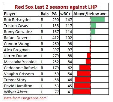
The Red Sox have had some weaknesses on offense and defense this year that need addressing. Here are FanGraphs’ numbers for offense, defense, and baserunning this year for the primary player at each position (leaving out first base as it is unsettled):
Outside of pitching, the Red Sox need better results this year from LF, SS, 2B, 1B. I think half of this will solve itself in time, and the other half can be solved by the end of May with help from Marcelo Mayer and Roman Anthony.
Duran will solve left field. He was the team’s best player last year, and top 10 in the MLB in everything – defense, offense, & baserunning. I think he’s having temporary struggles, and he’ll figure it out.
Campbell is new and it’s showing now. But his talent is such that I believe he will get much better, on offense with counteradjustments, and on defense with practice. No change needed at second base.
Story, I’m not so sure about. If he keeps slumping, I could see a platoon with Marcelo Mayer come about soon. That would solve shortstop.
So with that one change, that leaves just first base needing attention. I’ve come around to thinking that Roman Anthony needs to be the answer there. I know, it would be totally new for him. But it’s new for every other player they have playing there now. And he’s a good-not-great defensive outfielder trying to find a position on a team with three great defensive outfielders. Anthony is a quick study and I think he could come up to speed at first base quickly. He’s tall (6′ 3″) which helps at first base, though he throws right-handed, which is less than ideal when he needs to throw to 2B, but workable. Two weeks of playing first every day at AAA, and I think he’ll be as good as any other option they have now.
Bonus: with Mayer at SS and Anthony at 1B, Campbell would be flanked by two of his best friends from the minors, and that may increase his comfort level. The newness of everything could be part of what is going on with him.
It includes this lie: “the Red Sox’s overflow of left-handed hitters and the eventual need to move Devers down the defensive spectrum has led the team to shop their first baseman.”
What a doozy. Let’s break this down.
No shopping
The Red Sox have not shopped Triston Casas. That’s a myth that got started early after the 2024 season with a Ken Rosenthal speculated trade possibility. It was not based on any information about what the Red Sox were actually doing; it was just a guess at something they might try to do. But it got reported a lot. Then other prognosticators gave their dreamt-up trade scenarios involving Casas. And those got re-reported. Before long, a “where there’s smoke, there’s fire” mentality that developed among reporters, who started saying that they must be shopping Casas, given all this buzz about it. But the Red Sox stated that no such thing was happening. They had to tell Casas that they had no idea where all these rumors were coming from, and that they intended to keep him. At one point we did learn that Seattle had asked for Casas as part of a return for a pitcher that the Red Sox wanted, but the Red Sox essentially shut that down by saying Masataka Yoshida would have to be part of any trade involving Casas. That’s it. That’s not shopping Casas, but for some reporters it was enough to convince them.
So the latter part of Daniel Fox’s sentence is a lie.
No moving Devers
There is no plan to move Devers to first base. Most people think that if Devers is moved, he would actually move to DH. There’s no reason to think he would be an improvement defensively over Casas at first, so this idea makes little sense.
Also, Devers has clearly been promised by the team that he can stay a third baseman. He is highly opposed to playing anywhere else. They’ll likely need to keep him where he is.
No overflow of lefties
There is no overflow of left-handed hitters. The roster the Red Sox are most likely to open the season with would have more right-handed hitters than left-handed ones. For much of last year that was not true, because their two injured right-handed-hitting middle infielders (Story, Grissom) were replaced by left-handed hitters (Hamilton, Valdez). This helped cement their reputation as being to left-handed. But after Story and Grissom returned, all it took was one added right-handed bat to make them more right-handed than left. That happened when they signed Alex Bregman.
But the real issue isn’t the number of right-handed hitters, it’s the number of players who hit left-handed pitching well. And when it comes to that, it turns out that Triston Casas has been the second-best on the current team at hitting lefties over the past two years, behind only Rob Refsnyder. And the best among regular starters. The idea of making the team better against lefties by removing Casas is absurd. A much better way would be to remove Masataka Yoshida or Wilyer Abreu.
Daniel Fox managed to pack a lot of wrong ideas into that sentence quoted above. It’s bad enough to add to the Hall of Shame.
In my article from last December, Did the Mets overpay for Juan Soto?, I shared an analysis of all the signings of the biggest free agents (3.0+ WAR) going back to 2018. I compared the expected annual WAR of recently signed position player free agents (or free-agent-eligible players who were extended) to the average annual salary they got in their contracts. (I used the average of bWAR and fWAR, and because some players missed parts of seasons, I adjusted everyone’s WAR to a 150 game season.) I plotted the values of millions of dollars per WAR for each player against the year in which they signed or extended. I adjusted everything to 2024 dollars.
Juan Soto was the biggest overpay according to that plot.
After making that plot, and noticing a strong age-related trend, I made another plot that adjusted for age at the time of the signing. This was a plot of millions of dollars in annual salary per WAR over expected. Soto was not the highest on this plot, but near it, and he seemed to reset the market a bit. Most players this offseason have signed at “the high end of normal”.
And when I then heard that Alex Bregman had signed with the Red Sox for $40M a year, I added him to the plot, and said “Alex Bregman just blew all that out of the water”. But, I was wrong.
Here is the age-adjusted plot as I initially updated it, with Christian Walker, Teoscar Hernandez, and Alex Bregman added.
Yikes. This isn’t even close. Everyone else is within $2M/WAR of their expected value, whether above or below. Bregman was more than $3.5M/WAR over.
However, I then learned that much of his salary would be deferred, making his salary in terms of 2024 dollars around $31.7M per year. When I updated my charts with this new number, things became reasonable again. Here is the corrected version:
He’s near the top, but no longer an extreme outlier – almost not an outlier at all.
Things look even better for Bregman in the non-age-adjusted plot. Here is the initial, non-age-adjusted plot, with Bregman, Walker, and Hernandez added. Bregman’s contract had been the biggest overpay even without the age adjustment …
… but after switching from the nominal $40M AAV to the Competitive Balance Tax value of $31.7M a year, he’s down into the pack:
And given the very short term of the contract, being older at the time of signing matters less, because they’re all prime years.
If you want to see the numbers behind this plot, here is the updated chart of data that I worked from, with Christian Walker, Teoscar Hernandez, and Alex Bregman added.
I had Bregman’s expected pay per year at $24M to $25M, based on his trend in WAR values. So the $40M number was shocking. But the $31.7M sounded reasonable, especially given the short 3-year term for the deal, and the opt-outs. And the fact that the big contracts for Masataka Yoshida and Trevor Story would be due to come off the books at the same time – it makes it look as though the Red Sox are aiming to get back under the luxury tax threshold for 2028.
What I didn’t factor in, though, is that Bregman is worth more to a team than his WAR indicates. He is the ultimate unofficial player-coach, on a team with so many young, new players who can use exactly that. He challenges young players to prepare in ways they’d never imagined before. He talks a ton to every player and has a lot of good advice.
So what I’d initially called the “biggest overpay in recent history” by far, now looks like a completely reasonable contract.
I’m sorry Red Sox, and Alex Bregman, for my previous harsh words on this.
Two years ago I wanted to estimate the market values of some of the free agents coming out of the 2022 MLB season. So I did some analysis then comparing the expected annual bWAR of recently signed free agents to the average annual salary they got in their contracts. It gave me interesting insights on what to expect in free agent contracts that year.
Just over a week ago I wanted to see if Juan Soto was about to be overpaid, based on the same analysis. I updated a lot of things about my previous analysis, and learned that yes, he was indeed about to be overpaid. But before I could publish this article about it, he actually did sign. So now I’m here to tell you that he was overpaid, and what I’m basing that on.
It’s not based on Steve Cohen’s ability to pay. The owner of the Mets’ pockets are so deep, this kind of money barely affects him.
No, this is about whether the average annual value of his contract is in line with other recent free agent contracts for the most talented players in the game, given his age and the value he provides.
All the players used for comparison in this analysis are position players, with the partial exception of Shohei Ohtani. For him, I added his pitching WAR to his position player WAR.
For the table and charts below, instead of using just Baseball-Reference’s WAR (bWAR) as I did the first time, I averaged it with Fangraphs’ WAR (fWAR). When adding in Ohtani’s pitching WAR, I weighted bWAR more heavily, as I trust it more (it considers all of the pitchers’ results, and not just 37% of them like fWAR does).
I didn’t usually use all the WAR accumulated over the player’s entire career for this. It was always the last few years, as of the time of their signing. How many of those last few years to use was a judgement call -whatever span of seasons I felt best represented who the player was as a player at that moment. In the second and third columns of the table you can see the years I picked, and so can cross examine my choices if you want.
To get WAR per 150 games, I got their WAR totals over the chosen years, divided by the number of games played, and multiplied by 150. I only used players for whom this value was at least 3. Below that, in my judgement, WAR starts behaving less like a cumulative statistic, and more like a rate statistic, and so the assumptions on which this analysis are based start to break down.
The next column is the first year of “free agent” pay. I put “free agent” in quotes because I’ve included some players who signed extensions that overlap their free agent years. For those players, the year in this column isn’t the year the extension begins, but the year their free agency would have begun. We only consider the portion of the extension that overlaps what would have been free agent years, because the previous parts of the extension will usually provide much lower salaries, and that would skew these results. As it happens with the players in this list, this year is never more than a year delayed.
In next to last columns, you’ll see me convert into 2024 dollars the annual amount paid to the player per WAR. In most cases I’m moving past amounts forward in time, but in the case of Shohei Ohtani’s almost entirely deferred $700 million contract, I’m first bringing that deferred money back to 2023 dollars, which results in the $460 million estimated value that they’re using for the purposes of the Competitive Balance Tax. Then I move that forward one year to 2024 dollars. When you do that, you get that the Ohtani contract is actually a pretty good deal. (This devaluing effect of deferred money makes it wrong to directly compare the dollar totals of the Ohtani contract to those of the Soto contract.)
That last column is the one I’m plotting in the chart below. I got it by dividing the average annual salary of the contract by the player’s evaluated WAR per 150 games. So you have millions of dollars per WAR. This I plotted against the season after which they signed the contract or extension. Each data point is labeled with the player’s name, their age on June 30 of the first year of their contract, and their age on June 30 of the last year of the contract. The results are as follows:
There are a few things to note here. One is that, over time, the range of values you get each year is about the same, once you make the inflation adjustments. That gives me confidence in comparing 2018’s free agents against 2024’s.
So that makes it easier to look at this chart and decide yes, Juan Soto was overpaid. He’s a clear outlier.
But not so fast. Look at the ages that follow each name. If you focus on the first number, you’ll notice that the top of the chart is populated almost entirely by players who were 28 or younger in their first contract year, whereas below that almost everyone is over 28. Youth appears to be a factor in accessing higher dollars per WAR.
We can get a clearer view of the age trend by plotting millions of dollars per WAR against age as of the first contract year. I have intentionally left Juan Soto out of the plots below, because the idea is to compare his result to what the market had done before him. (Ages are not rounded in this next plot; they are precise to the day as of June 30 of the first year of the player’s contract.)
There is a trend there to be seen, which the R² of 0.33 confirms as a moderate relationship. But it is not as obvious to the eye as it might be. It is easier to see if we group together all players of the same age in years, and average their numbers. Here is what that looks like:
A definite downward trend. Note that there are much fewer players contributing to the average at the extremes of age, especially just one each for the age 33 and 34 player groups. Those few players could really alter the slope of the fitted line. So I made multiple versions of both plots, some with those players at the extreme ends left out, some with Juan Soto put back in. The line was pretty similar in all of them. I picked one that had a slope that was in the middle of the pack, and I used that line in my next step. (For the curious, the line used is y = -0.3248x + 15.51 where x is the player age and y is the millions of dollars per WAR they make.)
That line provided me the expected average value of millions of dollars per WAR that players of a certain age in their first contract year would make. I then just subtracted that from each player’s actual number to get an amount, in millions of dollars per WAR, above or below this average that the player made. Here is the new version of the first plot when redone in this way, to remove age as a factor:
So that changes things a bit. Juan Soto is no longer an isolated outlier on the high end, but only the third worst overpay after Anthony Rendon in 2019 and Freddie Freeman in 2021. Yet it’s the 15-year duration of that overpay that will make it worse in the end. Freeman’s contract is 6 years long, Rendon’s 7. Neither contract goes past their age 37 season; Soto’s goes all the way to his age 40 season. He’ll surely have been relegated to a full-time DH well before then, and will rack up a great many years underperforming his contract.
I’d like to do another analysis along these lines that considers the contract’s duration as well. Maybe by looking at overall contract value? Or perhaps overall amount of risk? This could get complicated – I’d probably have to get into aging curves to handle that properly. My point being that such an analysis would probably make the Soto contract even more of an outlier, more of an overpay.
Another thing we can see on this chart that many people may find shocking is that Shohei Ohtani may actually have been underpaid. Because future dollars are worth less than today’s dollars, and he’s paid almost exclusively in future dollars, his $70M per year sounds like more than it really is. Plus, he’s been consistently producing over 9 WAR each of the last 4 years (only the first 3 of those counted in this analysis). Not even Mike Trout in his prime was that consistent. He produces more value than anyone else on this list. His 9.44 WAR/150 G is more than 50% higher than 5th place Juan Soto’s 6.21. Heading into the 2024 season, when he knew he wouldn’t be able to contribute with his pitching, Ohtani turned himself into an elite baserunner by putting in a lot of work on learning that craft. The guy just finds a way to excel and provide value, whatever his circumstance. If future injuries don’t tank his value the way they did for Trout, he’ll be worth every penny.
As a Red Sox fan, there are a couple of other data points on this chart that are interesting to consider. One is Rafael Devers. I have always thought of his 2022 extension as a big overpay, 50% higher than what he should have gotten. But in this new chart, though he is still on the high end of things, I’d say he’s a little shy of being an overpay.
Finally, there’s that Mookie Betts contract. We’ve now learned that had the Red Sox just offered him the contract that the Dodgers eventually did, he’d have signed and would still be a Red Sox today. But the Red Sox were really down on big contracts at that time, and wouldn’t offer Betts what he wanted. Well, here we see that Betts’ contract with the Dodgers is actually one of the biggest bargains in the game. The Red Sox were wrong in their offers, Betts was right to reject them, and my favorite team let my favorite player get away because they were just so excessively stingy. It’s hard to forgive that.
They’ll have some chances soon here at a do-over, though. Jarren Duran is the real deal, and should get paid a lot. Not just for his great results on the field, but for how his constant hustle inspires his entire team to try harder. And I am expecting upcoming prospects Roman Anthony and Kristian Campbell to become as valuable as Betts was. The Red Sox can pay them what they’re worth, or they can offer what they’re comfortable paying, and watch them all walk. Please, Red Sox, learn the lesson from your mistakes with Mookie Betts. You could have a great team for the next decade if you just pay your stars what they’re worth.
So by now (late October 2024), all votes are in for 2024 AL and NL Rookies of the Year, so at this point anything I say in this article is me ranting and complaining about something that I think has already happened, but won’t know for certain has happened until three weeks from now. Nothing I can do to change it now!
But if you read articles like this one, you get the idea that Colton Cowser is the consensus pick to be AL Rookie of the Year for 2024. Or at least it’s down to him and Luis Gil.
Then there’s this betting odds line from when there were 5 days left in the season. It had Luis Gil with a greater than 50% chance to win, with Colton Cowser and Austin Wells also having good chances, and Wilyer Abreu being an extreme longshot, with a less than 2% chance to win it.
Luis Gil and Colton Cowser. Why these two? It seemed to me like there was a crowded field of top candidates in this race.
Well, someone in that article mentioned WAR as part of their reasoning. And though WAR isn’t the be-all end-all criterion for choosing Rookies of the Year and MVPs, I think it’s a great first step in creating a pool of top candidates to ponder and consider, to compare and contrast. So I considered it. I considered it in 16 different ways, in fact.
So it was interesting to learn in this assessment of the WARs that AL rookies accumulated in 2024, that Gil maybe shouldn’t even be in the mix. I have him as just outside the 6 strong contenders, who are, in alphabetical order:
Wilyer Abreu Colton Cowser Wyatt Langford Mason Miller Cade Smith Austin Wells
How did I come to that conclusion? Well let’s start by looking at the top WARs of AL players. Note that there are two different commonly used ways of calculating WAR, that are scaled to be a similar size, but can produce quite different answers for individuals. One of these ways comes from Baseball-Reference.com, and it is often labeled bWAR for clarity. Here are the AL rookies with the highest bWARs for 2024:
There are Gil and Cowser, but they’re in the third and fourth spots. Yet they’re both within 1 WAR of the leaders, Wyatt Langford and Wilyer Abreu, which is not considered a truly significant difference.
What does the other WAR look like? It is calculated by FanGraphs.com, and it is often labeled fWAR for short. Here are the AL rookies with the highest fWARs for 2024:
Ah, there’s Cowser at the top. But Gil is in 7th place? And of the 8 players appearing on both lists, none of them are in the same place as before. Also, as with bWAR, a lot of guys are within 1 fWAR of each other.
Some of these differences are surely indicative of the inherent inaccuracies of estimating the value of a player’s performance. That said, WAR is our best current tool for objectively attempting to measure the overall value of a player’s performance. We just must recognize the approximate size of those inaccuracies, and as others have said before me, we must use WAR as a conversation starter, not a conversation ender.
But hey, maybe we can squeeze a little more accuracy out by averaging the bWAR and the fWAR? That looks like this:
Colton Cowser on top again (thanks to his high fWAR), but the top 6 guys all within one WAR of each other! And a new top 2. This makes things look even tighter.
But maybe it would be better to look at each player’s peak assessment – their highest WAR attained between the two systems?
The same top 4 and top 5 as with the average WAR, though a different top 3. But no … maximum can be completely influenced by one system having a very inaccurate high assessment. Having a high minimum WAR between the two systems only happens if both systems rate you highly – we should therefore have more confidence in a high minimum WAR than a high maximum WAR. Here’s what that looks like:
Well that shook things up a bit! A new name on top.
But looking over all five lists, there are four names always hanging out near the top – (alphabetically) these are Wilyer Abreu, Colton Cowser, Wyatt Langford, and Austin Wells. Perhaps we should declare these four in a dead heat as far as WAR is concerned, and focus on these four in determining, using other measures, which one should be AL Rookie of the Year. But Luis Gil is not part of that group. Why is he such a frontrunner for Rookie of the Year, then? I’ll share some thoughts on that later.
But hang on. There’s an important factor we haven’t considered here: playing time. Among the highest performers, WAR acts like a counting statistic – the more you play, the more WAR you accumulate. So in comparing top players, it may be more appropriate to turn WAR into a rate stat by dividing it by some measure of playing time. So let’s do that.
For position players, I like to use plate appearances as the measure of playing time, as plate performance has an outsized effect on overall WAR.
For pitchers, I like to use batters faced instead of innings pitched, because it’s the number that is most relatable to the position player’s plate appearances. In fact, if you add up all players’ plate appearances over all of MLB for an entire year, you get exactly the same number as you get when totaling batters faced in the same way.
But pitchers as a whole don’t get as much WAR as position players do. Probably rightly so, because position players can add to the run values of their batting contributions with their defense and/or baserunning; pitchers can only add value by reducing the run contributions of the batter. Because major league players collectively will do better than replacement-level players at baserunning and fielding, on average these will add a positive amount of WAR on top of their batting contributions. Pitchers only have access to the run values available in the pitcher/batter interaction.
So since there’s less WAR to go around for pitchers, to assess how good their play was against position players, we must grant them more opportunity by allowing them to accumulate WAR over a larger number of batter/pitcher interactions. Looking at the numbers from 2023 and 2024, I found a pretty consistent trend: position players get a little over 40% more fWAR per batter/pitcher interaction than pitchers do, and a little over 50% more bWAR. To be a little conservative about it, I used the 40% and 50% adjustments. So we calculate WAR per 500 plate appearances for position players, fWAR per 700 batters faced for pitchers, and bWAR per 750 batters faced for pitchers. These numbers were chosen to get into the vicinity of one season’s worth of plate appearances.
The results of this adjustment for all five tables we made before can be found below.
Now you may object to my adjustment, and insist that position players and pitchers should be evaluated based on equal numbers of batter/pitcher interactions. Okay, to humor you, I also did the same five tables as before that way – WAR per 500 PA for position players, and WAR per 500 BF for pitchers. So now we have 10 new tables to show you.
But before we do, we have one more adjustment to make. Because we’re dealing with rate stats now, players with a lower number of chances will be able to ride a “hot streak” of good luck to achieve higher rates than a player with more chances is able to access. So we insist on a minimum number of chances – 400 for each. If a player has below 400 PA or BF, we divide their WAR total by 400 instead of by their actual, lower number. It’s like we’re assuming that a player with 300 PA would have accumulated 0 WAR over their next 100 PA.
With that adjustment, now we’re ready. Here are the five tables using WAR per 500 PA and WAR per 700 or 750 BF:
Wow, Cade Smith and Mason Miller completely took over the top of the lists!
But here are the five tables using WAR per 500p PA/BF. Will they stay atop those?
They’re not atop these, but still placing higher than before, as are David Hamilton and Parker Meadows. But the new dominant pair on these five lists are Wilyer Abreu and Austin Wells. And Luis Gil has nearly disappeared from them!
All these lists, all 15 of them looked at collectively, tell a tale of ambiguity. These 15 lists have 14 different top 3s. There are nine different players occupying top 3 positions. There are five different players occupying the top position of a list. There is no clear cut frontrunner here!
But surely some are appearing near the top moreso than others. Here’s one thing we can do to sort those out: for each player, find their highest position on any list, and their lowest position on any list. Here is what that looks like:
And there we see the two runaway favorites to win AL Rookie of the Year coming in behind five other guys. And looking at their numbers, I can see that a good case could be made to vote for Wilyer Abreu, Cade Smith, or Wyatt Langford over Colton Cowser or Luis Gil. Maybe even Austin Wells too.
So why are Cowser and Gil so favored to win?
Is it because they’re from major markets? No, because Wilyer Abreu is from a major market.
Is it because most of the others played less? I think that is a factor, especially for Cade Smith, who as a reliever doesn’t face nearly as many batters as starting pitchers do. And a little bit for Wilyer Abreu, who missed part of the middle of the season due to injury.
But I think the biggest factor is that Colton Cowser and Luis Gil played for playoff contenders, and except for Cade Smith and Austin Wells, most of the rest didn’t. And the fact that that’s probably true really makes me sad.
Why should otherwise equal players be judged differently based on the performance of the other players on their teams? That makes no sense, and should not factor at all into the voting. But I fear it does. It’s looking like Wilyer Abreu and Wyatt Langford will be cheated of Rookie of the Year votes due to not playing on contenders, and Cade Smith will be cheated out of votes for lack of playing time.
Here’s hoping the prognosticators got it wrong, and we see Cade Smith, Wilyer Abreu, and Wyatt Langford finish with strong scores in the Rookie of the Year voting.
Of course, one could say that the “most .500” Major League Baseball team in any given year is the one whose record is closest to .500, or 81-81 in a full season. But even a hypothetical team that always had exactly a 50% chance of winning would sometimes end up, by luck of the “coin flip”, a few games away from .500.
And what about a team that’s great for the first half of the season, then awful for the second half, ending up with a .500 record? They weren’t really a .500 team at any point in the season, in that their chance of winning games wasn’t actually close to 50% at any point, nor were they winning about half their games in any given week.
So here are a few different ways to measure how .500 a team was, along with the top teams by each method.
Final Record
We can just look at a team’s final record and see how many games away from .500 it was, above or below.
The Boston Red Sox had the only .500 record, but several other teams were close.
The run differential of a team is the runs it scores over the entire season minus the runs it allowed in that same time. A small run differential is a good predictor of a team that will have a record near .500. (There is even a stat called Pythagorean expectation which estimates what record a team should have based on it totals of runs scored and runs allowed.)
Whose run differential was closest to 0 in 2024?
Four teams had a run differential close to 0. Of these, again, the Boston Red Sox were the closest to 0, just barely. It seems we have a frontrunner.
Number of times at .500
A team that plays “a .500 brand of baseball” throughout the season is likely to have a winning percentage of exactly .500 at several times during the course of the season. The most times this could possibly happen is 81, though even for a hypothetical team that always has a 50% chance of winning, the odds of that happening 81 times are over 2,000,000,000,000,000,000,000,000 to 1 against. The most times it’s ever been done, at least before 2020, is 35 by the 1959 Chicago Cubs.
The Tampa Bay Rays came close to that this year, tying for 3rd most. The Padres, Red Sox, and Cardinals also had a lot.
For fun: consecutive times at .500
This last one is more about the luck of streaks than anything else. But there was an interesting streak this year in this regard, so I thought I’d throw it in.
When a team is at .500 in the middle of the season, the next game they play takes them off of .500; it’s only 2 games later that they can be back at .500 again. So a streak of consecutive times at .500 means that at the end of every 2 games played after being at .500, they’re back at .500 again.
The Red Sox were at 26-26 on May 25, 2024 – 26 wins and 26 losses. Two games after that they were 27-27, then 28-28, 29-29, and so on up to 35-35. That’s ten times in a row at .500. The likelihood of that happening, once a team has reached a .500 record, is more than 500-to-1 against.
Here are the longest such streaks in the majors in 2024:
The “Winner”
It’s gotta be the Boston Red Sox as The Most .500 Team of 2024. They top every list except number of times at .500, and they did pretty well there, too. Runner up goes to the Tampa Bay Rays.
Interestingly, these two teams played each other in their last 3 games of the season, with the Rays winning the first two but losing the final game. Had they won it, they would have replaced the Red Sox atop the Final Record list, probably solidified the Red Sox hold on the Run Differential list, but strengthened their own position atop the Times At .500 list. That game was something of a battle for Most .500 Team of 2024. Congratulations, Red Sox, on your “victory”!
Tanner Houck pitched most of the innings for the Boston Red Sox in Friday night’s 7-5 win over the Detroit Tigers. (Here’s the box score.) He gave up no runs, and left the game with a 4-run lead. So they should award him the win, right?
Except that they didn’t. Because the 74-year-old rules for awarding wins often give them to less deserving pitchers, as they did in this case. The rules award it to the pitcher who was pitching when his team took its final lead, even if that pitcher pitches poorly. This system often gives a pitcher a win because he pitched worse than he might have, as it did last night. If the Red Sox’ closer Kenley Jansen had kept the Tigers from scoring, Houck would have gotten the win. But because he allowed the game to become tied, and then his team took the lead for good the next inning, he got the win (and the “blown save”).
Earning the win in this way is called a Vulture Win. It’s the worst of the seven reasons why (in my estimation) the current method of awarding wins to pitchers is flawed, and needs to be replaced. (That’s a list of reasons I haven’t yet blogged about, though I really should. At least I list some of them here.)
Using that method, we take the 7 runs that the Red Sox scored in Friday’s game and divide by 10 (the number of innings the Red Sox were at bat) to get the average number of runs they scored each inning (7/10, or 0.7). We then credit each Red Sox pitcher with this number of runs for every inning they pitched. We see this in the first three columns in the table below, IP, RCr/IP, and RCr, which stand for Innings Pitched, Runs Credited per inning pitched, and Runs Credited, respectively. You get the third column (Runs Credited) by multiplying together the first two.
Pitcher
IP
RCr/IP
RCr
R
RA
Result
T. Houck
6
0.7
4.2
0
4.2
Bernardino
1 ⅓
0.7
0.933
3
-2.067
J. Slaten
⅔
0.7
0.467
0
0.467
Hold
K. Jansen
1
0.7
0.7
1
-0.3
Blown save, win
C. Martin
1
0.7
0.7
1
-0.3
Save
Runs Ahead (RA) calculations for Red Sox pitchers in victory over Detroit Tigers, August 30, 2024
Then you subtract runs allowed (R) from this to get each pitcher’s number of Runs Ahead (RA) for that game. Because Tanner Houck had the highest number of Runs Ahead for the winning team, he would be awarded the win by the merit method. But by current rules, the win went to the guy who blew the save. (Nothing against Jansen, he’s been great for the Red Sox. I just have something against awarding wins they way it’s currently done.)
There a couple of cool things about this method that happen when a whole number of innings is played. One is that when you add up all the Runs Credited (RCr) for each pitcher, you get the number of runs your team scored in the game. Even better, when you add up all the Runs Ahead (RA), you get the margin of victory (in this game, 7 – 5 = 2). So Runs Ahead is like the part of the team’s margin of victory that that pitcher is responsible for. As you may notice, some of these numbers are negative. And when a team loses, there are always some pitchers with a negative Runs Ahead (and when a team wins, there are always some with a positive RA). You can use the merit method for assigning the losing pitcher, too – the pitcher on the losing team with the most negative RA. And so, the winner always has a positive RA, and the loser always has a negative one.
There was no way Tanner Houck was ever going to complete the game he started for the Boston Red Sox on Saturday. He’d been moved to their bullpen a couple of weeks before, and was no longer stretched out enough to throw a complete game. People had their expectations set at 3 innings, when thinking about how many innings he’d complete. So to get 5 perfect innings was huge.
A nice bonus for Houck was that by completing 5 innings with the lead, he was qualified to be awarded the win. All the Red Sox’ relief pitchers had to do was maintain that lead through the rest of the game.
But they didn’t. They allowed the game to become tied, which took Houck out of the running for the win. The win went to Austin Davis, only because he was lucky enough to have been the last Red Sox pitcher to have thrown a pitch, at the time his team broke the tie and built a 4-run lead in the 9th inning. His results, 2 runs allowed over ⅔ of an inning, were the worst of any of the six Red Sox pitchers in the game; for this he was awarded the win.
Using that method, we take the 5 runs that the Red Sox scored in Saturday’s game and divide by 9 to get the average number of runs they scored each inning (5/9, or 0.56). We then credit each Red Sox pitcher with this number of runs for every inning they pitched. We see this in the first three columns in the table below, IP, RCr/IP, and RCr, which stand for Innings Pitched, Runs Credited per inning pitched, and Runs Credited, respectively. You get the third column (Runs Credited) by multiplying together the first two.
Pitcher
IP
RCr/IP
RCr
R
RA
Result
T. Houck
5
0.56
2.78
0
2.78
G. Richards
1
0.56
0.56
0
0.56
Hold
R. Brasier
1
0.56
0.56
0
0.56
Hold
A. Ottavino
⅓
0.56
0.19
1
-0.81
Hold
A. Davis
⅔
0.56
0.37
2
-1.63
Win
H. Robles
1
0.56
0.56
0
0.56
Save
Runs Ahead (RA) calculations for Red Sox pitchers in victory over Washington Nationals, October 2, 2021
Then you subtract runs allowed (R) from this to get each pitcher’s number of Runs Ahead (RA) for that game. Because Tanner Houck had the highest number of Runs Ahead for the winning team, he would be awarded the win by the merit method. Instead, he was the only one of the six Red Sox pitchers that night who wasn’t awarded anything. Some thanks for being perfect.